Modern Lab Management System in Zambia: Smart Solutions by Voxforem

Voxforem Technology
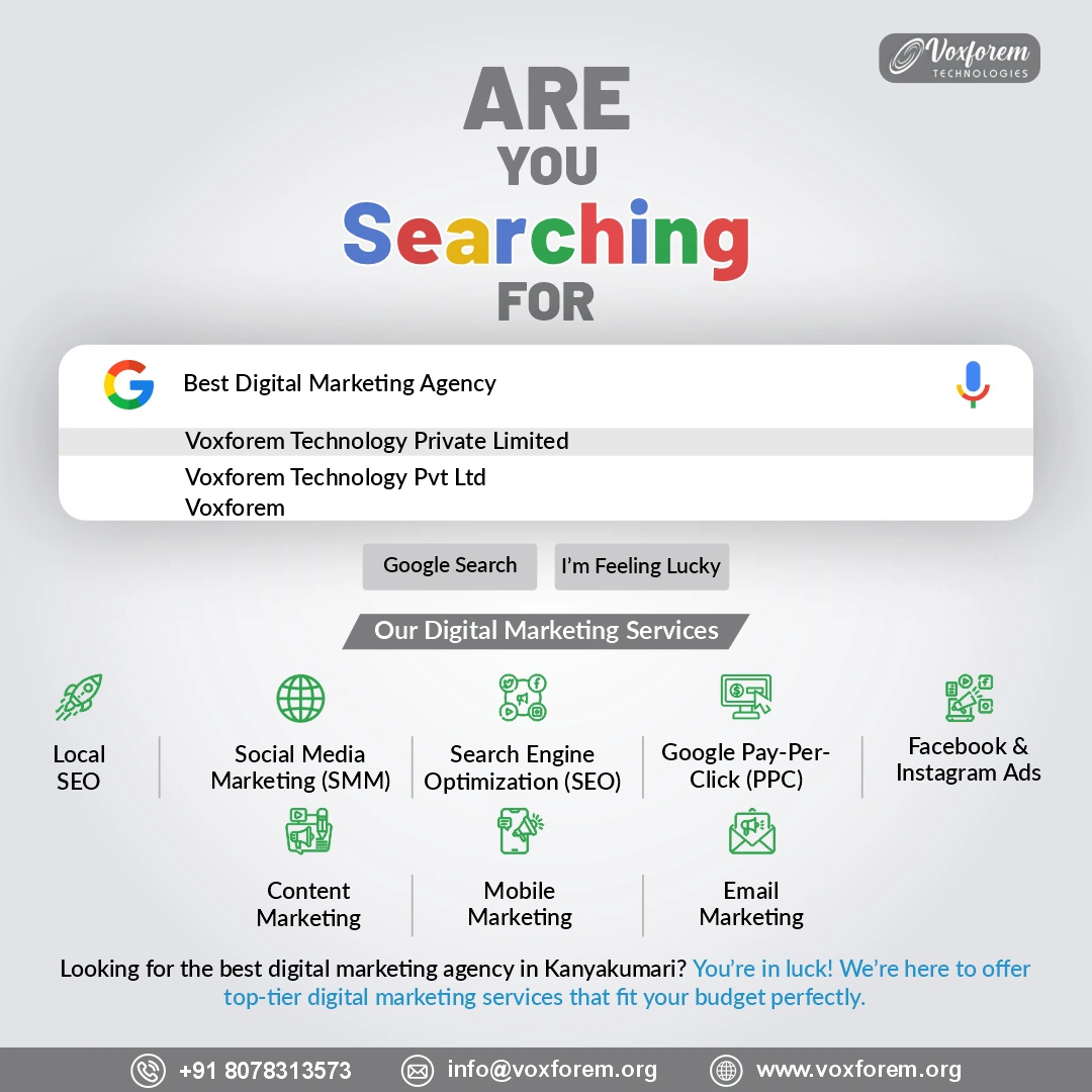
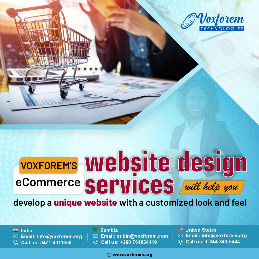
Voxforem Technology is a fast-growing global IT services company with a strong presence in Zambia, the USA, the UK, and India. We specialize in web development, mobile app development, custom software solutions, and digital marketing services helping businesses of all sizes embrace digital transformation.
Let’s Together!Contact Info
- 9b Ngwezi road ,Roma ,Lusaka ,Zambia
- 31/80 North Street, Opposite LIC Building, Marthandam, Tamil Nadu, 629165
- info@voxforem.org

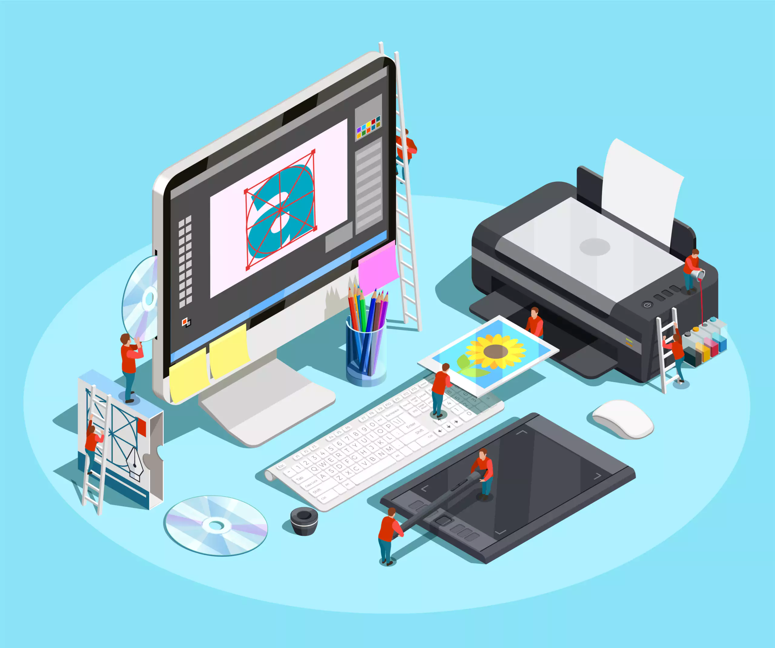
Overcoming the Biggest UI Design Challenges
When I first began working in UI design, I assumed success meant creating something visually stunning - clean lines, bold typography, and modern layouts. But as projects grew, I soon realised that design isn’t just about looks; it’s about how people feel when they use a product. Every project brings its own set of UI design challenges, and each one teaches you something new about users, patience, and perspective.
1. Balancing Beauty and Usability
One of the earliest lessons I learnt was that beautiful doesn’t always mean useful. You can spend days crafting a sleek interface, but if users can’t figure out where to click, it’s a failed design.
To find the right balance, I focus on:
A truly good design almost disappears — it simply works.
2. Staying Consistent Across Every Screen
Maintaining consistency is one of the trickiest user interface design challenges. When multiple designers or developers work together, small inconsistencies in buttons, spacing, or typography start to appear. Before long, the product begins to feel disjointed.
To keep everything unified:
It saves time and keeps the entire experience cohesive, no matter how large the project becomes.
3. Designing for Every Device
In today’s multi-device world, users constantly switch between laptops, tablets, and smartphones. What looks perfect on a desktop screen can often appear cluttered or hard to use on a mobile device. This inconsistency is one of the most common challenges that UI/UX Design Consulting helps to solve.
My approach is simple:
If something works beautifully on the smallest screen, it’ll scale naturally for larger ones too.
4. Simplifying Complex Information
Not every interface is straightforward. Dashboards, analytics tools, and admin panels often overwhelm users with information. Simplifying without losing meaning is a delicate balance.
To make data digestible:
The secret is to help users absorb information without thinking too hard. The easier it feels, the better the experience.
5. Listening to Real Users
It’s tempting to believe you know what users want — until you actually watch them use your design. I once worked on a project that looked perfect on paper, but during testing, users completely missed the main menu. It was a wake-up call.
Now, I make sure to:
User feedback always shapes a stronger design. Small insights can turn an average interface into something intuitive and memorable.
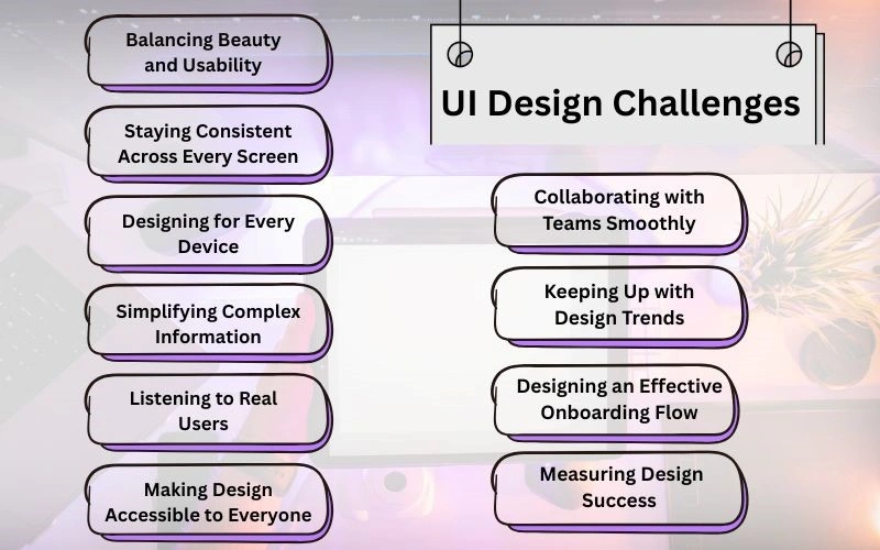
6. Making Design Accessible to Everyone
Accessibility is no longer optional; it’s a responsibility. Yet, it’s one of the most overlooked UI design challenges in the industry.
Designing for accessibility means:
Inclusive design isn’t a trend; it’s good practice — and it ensures everyone can interact comfortably with your product.
7. Collaborating with Teams Smoothly
A great interface often depends on great teamwork. When communication breaks down between designers and developers, even the best ideas can fall apart.
To keep projects aligned:
Collaboration isn’t just about speed — it’s about shared understanding and ownership.
8. Keeping Up with Design Trends
The design world changes fast. One year, flat design is in; the next, it’s glassmorphism or minimalism. Staying updated without losing identity is another ongoing daily UI challenge.
Here’s how I manage it:
Trends come and go, but clarity and purpose never go out of style.
9. Designing an Effective Onboarding Flow
Even the most polished interface can fail if users feel lost at first glance. Onboarding is your chance to make a strong first impression.
To create smooth onboarding:
A good onboarding experience builds trust and keeps users engaged from the start.
10. Measuring Design Success
A design might look great, but how do you know if it works? Measuring performance is often overlooked, yet it’s crucial.
I track metrics such as:
Numbers tell the story behind design decisions - and help you continuously refine what works.
Turning UI Design Challenges into Opportunities
Every designer faces unique UI design challenges, but each obstacle is an opportunity to learn and improve. From balancing beauty with usability to ensuring accessibility and consistency, great design is built on empathy, clarity, and continuous refinement. The real success lies not in how impressive a design looks, but in how effortlessly it works for users.
For businesses aiming to create user-focused digital experiences that truly connect, Voxforem provides expert UI UX Design Services in Zambia, helping brands transform challenges into powerful, intuitive, and memorable interfaces.